Introducing Dynamic Planograms That Can Think For Themselves
Picture the end of a quarter. A category manager is staring at a sales report, trying to figure out what to cut and what to keep. Some products are down. Some are flat. Nothing in the report explains why. So they make their best call, update the planogram, send it to the field, and wait. Wait for the next report. Wait for someone to walk the floor. Wait to find out, weeks later, whether it worked.
That waiting is not a process failure. It is a structural one. The tools and data available for planogram decisions were never designed to close that loop. And the industry has been living with the consequences ever since.
This post is about what changes when a dynamic planogram can actually think for itself.

The Problem Nobody Has Solved
Most planogram decisions are built on sales data. What sold the most gets more space. What sold the least gets cut. That logic sounds reasonable until you realize that sales data cannot tell the difference between a product with genuinely low demand and a product that was never available long enough to sell.
A product stocked out every afternoon before the evening rush looks identical on a sales report to a product nobody wanted. Both show low numbers. One of them is a missed opportunity hiding in plain sight.
The tools built to solve this have not helped. Enterprise planogram software is designed for specialists. It takes hours to set up, requires manually sourcing product dimensions and images, and exports flat PDFs that get emailed to the field with no confirmation they were received, understood, or executed correctly. Once deployed, the planogram enters a black hole. No feedback. No visibility. No way to know if it worked until the next sales report lands weeks later.
The gap between the planogram decision and the planogram result has always been invisible. That invisibility is where performance quietly disappears.
What If the Planogram Already Knew?
A dynamic planogram built on real shelf data would not start with sales numbers. It would start with a complete picture of what is actually happening on the shelf.
Not just what sold. What stocked out. How long it was unavailable. How many facings were present versus how many should have been. Whether the product that looks like a low performer on the sales report has actually been missing from the shelf half the time.
With that picture, every slot becomes readable. Not as a revenue number, but as a demand signal. High demand, low availability means that product needs more facings. Low demand, no stockouts means that product is a candidate to give space to something performing better. The shelf stops being arranged by gut and starts being arranged by what customers are actually trying to buy.
Imagine a Demand Score on Every Slot
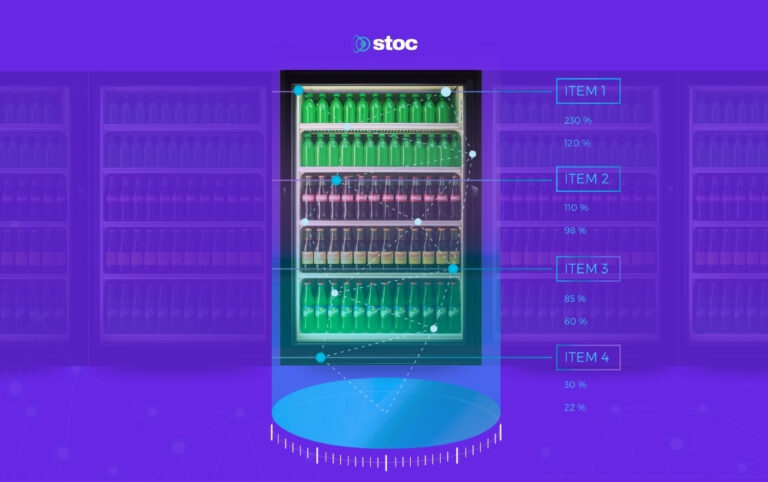
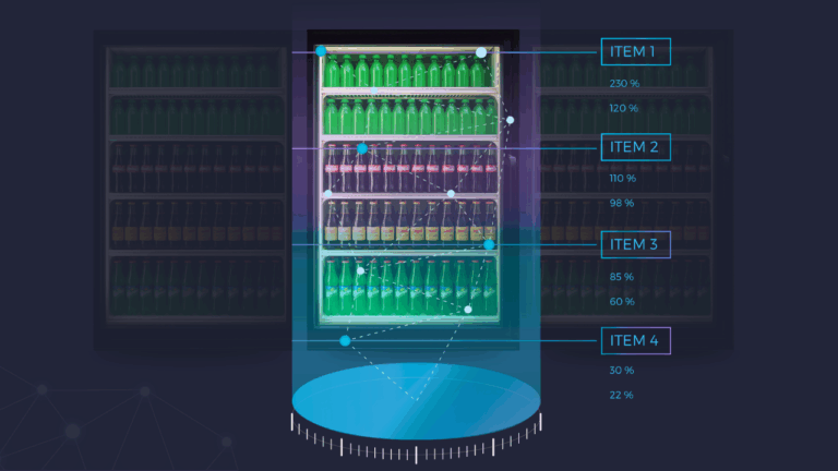
Now imagine looking at your planogram and seeing every product scored. Not just ranked by sales, but scored on true demand, combining sales velocity, stockout frequency, and missing facings into a single number that tells you what each product could be doing if it had the right amount of shelf space.
A product with a demand score of 90 is selling well, stocking out regularly, and constantly missing facings. It needs more space. A product with a demand score of 12 has not stocked out once, barely sells, and is taking up room that a higher-demand product could use. That product is a candidate for removal.
With a demand score on every slot, the dynamic planogram is no longer a snapshot of past sales. It is a live map of shelf performance, grounded in what is actually happening at that specific location, not what happened across a national dataset last quarter.
What If Recommendations Were One Click
A dynamic planogram does not just surface the problem. It tells you what to do about it.
Imagine opening your planogram view and seeing recommendations already generated. This product needs two more facings. This one should be removed. This slot is underperforming and here is what the data suggests replacing it with. Each recommendation is based on the demand score, the sales velocity, the stockout history of that specific cooler at that specific location.
Instead of taking those recommendations into a legacy tool, building a new planogram from scratch, exporting a PDF, and emailing it to the field, you accept them with a single click. The planogram updates. The change is logged. The expected revenue impact is visible before you publish.
That is the difference between a tool that shows you the problem and a tool that helps you solve it.
What If Publishing Took Thirty Seconds
The other half of the planogram problem is distribution. Getting a change from the decision maker to the person on the floor has always been slow and lossy. An email. A printed sheet. A photo texted to a manager. By the time it reaches the person setting the shelf, something has usually been lost in translation.
A dynamic planogram removes that entirely. Hit publish and 30 seconds later, anyone on the floor can pull up the updated planogram on their phone. No email. No printout. No version control problem. The planogram in the system and the planogram on the shelf are the same one, updated at the same time, visible to everyone who needs it instantly.
For the first time, the decision maker knows the shelf reflects what they decided, not what someone remembered from an email three days ago.
What If Any Operator Could Use It
One of the quieter problems with existing planogram tools is access. Most require significant training. The learning curve is steep enough that most operations have one person, sometimes two, who actually knows how to use the software. That person becomes a bottleneck. When they leave, the knowledge leaves with them.
A dynamic planogram built for the modern operator does not require a specialist. It is grid-based, drag and drop, and uses product images already captured from the shelf rather than pulling from external databases. Any operator can open it, see the current planogram, read the recommendations, make adjustments, and publish an update. No training course. No manual product catalog entry. No design work.
This is what democratizing planogram management actually looks like. Not just making the tool cheaper, but making it usable by the people closest to the shelf who understand it best.
The Loop Finally Closes
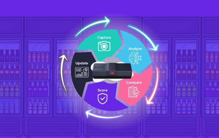
Put all of that together and something new becomes possible that has never existed in this space before: a truly closed loop dynamic planogram.
Build a planogram based on real demand data. Publish it instantly to the floor. Watch the shelf perform against it in real time. See which changes drove improvement and which did not. Generate new recommendations based on what the data shows. Update, publish, and measure again.
The planogram is no longer a static document that gets deployed and forgotten. It is a living system that learns from the shelf, surfaces what needs to change, and makes those changes easy enough to act on that operators actually do it.
The gap between the planogram decision and the planogram result, the black hole where performance has been disappearing for years, closes.
For the first time, an operator can make a planogram change on a Monday, see it on the floor by Monday afternoon, and know by Friday whether it worked. That has never been possible before. Not in this industry, not with these tools, not until now.
Something Is Coming
Stoc has spent years watching this problem from the inside, across food service operations, distribution networks, and convenience retail. The broken tools. The lagging data. The deployment black hole. The specialist bottleneck. Every piece of it.
We did not just study this problem. We built the solution.
Next week, Stoc is introducing something the food and beverage industry has not seen before. A placement tool that thinks for itself, built on proprietary shelf data, designed for the operator on the floor and the executive in the office at the same time.
Stay tuned.